black and white <…> behave perfectly colorlike next to the other colors, their equal in every way, as if long acclimatized.
Rainer Maria Rilke to Clara Rilke
OCTOBER 24, 1907 (Part 4)
The use of white as a color was natural to him from the start: together with black, it defined the two limits of his wide-open palette,
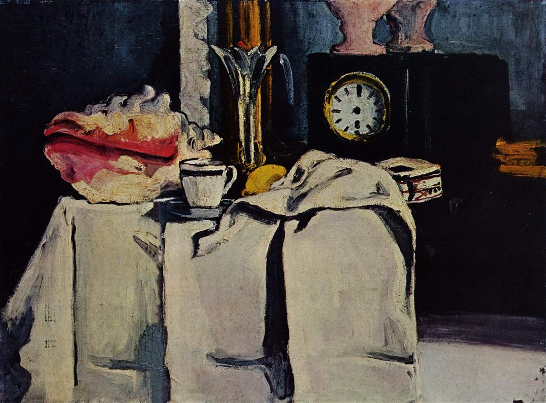
and in the very beautiful ensemble of a black stone mantelpiece with a pendulum clock, black and white (the latter in a cloth that covers part of the mantel and hangs over its edge) behave perfectly colorlike next to the other colors, their equal in every way, as if long acclimatized.
(Differently than in Manet, whose black has the effect of a light being switched off and yet still stands opposed to the other colors as if coming from some other place.)
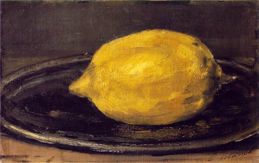
Brightly confronting each other on the white cloth are a coffee cup with a heavy dark-blue stripe on the edge, a fresh, ripe lemon, a cut crystal chalice with a sharply scalloped edge, and, way over on the left, a large, baroque triton shell—eccentric and singular in appearance, with its smooth, red orifice facing the front.
Its inward carmine bulging out into brightness provokes the wall behind it to a kind of thunderstorm blue, which is then repeated, more deeply and spaciously, by the adjoining gold-framed mantelpiece mirror;
here, in the mirror image, it again meets with a contradiction: the milky rose of a glass vase which, standing on the black pendulum clock, asserts its contrast twice (first in reality, then, a little more yieldingly, in reflection).
Space and mirror-space are definitively indicated and distinguished—musically, as it were—by this double stroke; the picture contains them the way a basket contains fruit and leaves: as if all this were just as easy to grasp and to give.
But there’s still some other object on the bare mantelpiece, pushed up against the white cloth: I’d like to go back to the picture to see what it was.
But the Salon no longer exists; in a few days it will be replaced by an exhibition of automobiles which will stand there, long and dumb, each one with its own idée fixe of velocity.
Rainer Maria Rilke to Clara Rilke
Presence. Intercourse of colors
As you read this portrait-in-words of a still life, don’t you find it hard to believe that it is written completely from memory?
Earlier, Rilke wrote about the greatness of Cézanne’s watching. In these descriptions from memory, we see his own great watching: the sheer quality of presence and attention he brought to this encounter with Cézanne.
I had to re-read the letter, following the flow of words around the picture with more focused attention, to even find that single object he forgot… Did you?