• Skip to content

The right eyes: Rilke on painting

Rilke on painting

Main navigation

  • About this program
    • Index
  • Resources

Black

Preoccupied with black

December 22, 2017 by Elena Maslova-Levin

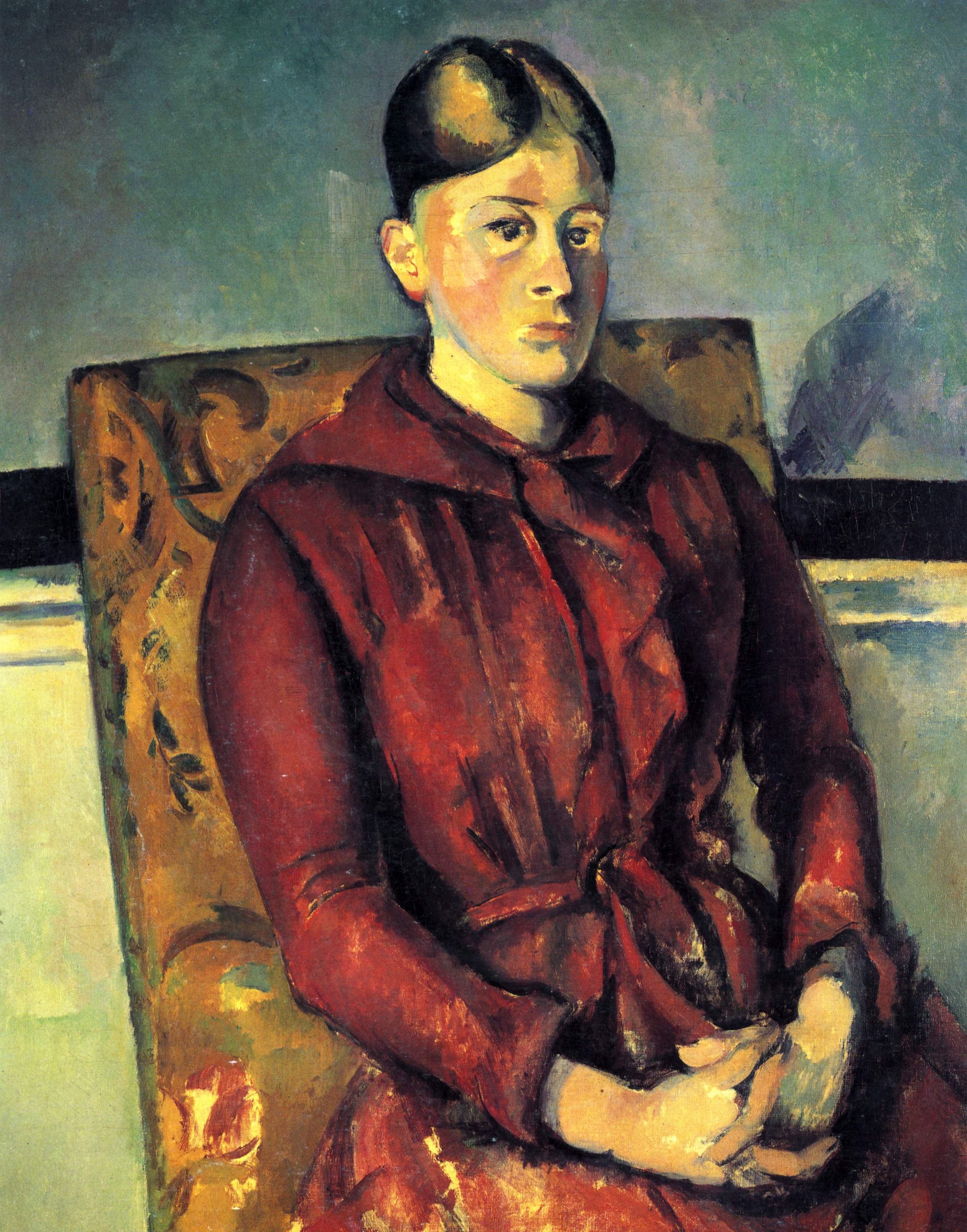
… black is treated purely as a color, not as its opposite, and is recognized again as a color among colors everywhere

Rainer Maria Rilke to Clara Rilke

The Salon has closed, and Rilke has left Paris for Prague, but this encounter with Cézanne isn’t over yet.


NOVEMBER 4, 1907 (Part 1)

… will you believe that I came to Prague to see Cézannes? … Outside in the Manes-Pavilion, where the Rodin exhibit used to be, there was (as I fortunately learned just in time) an exhibition of modern pictures. The best and most remarkable: Monticelli and Monet well represented, Pissarro adequately; 3 things by Daumier. And 4 Cézannes. (Also van Gogh, Gauguin, Émile Bernard: each with several pieces.)

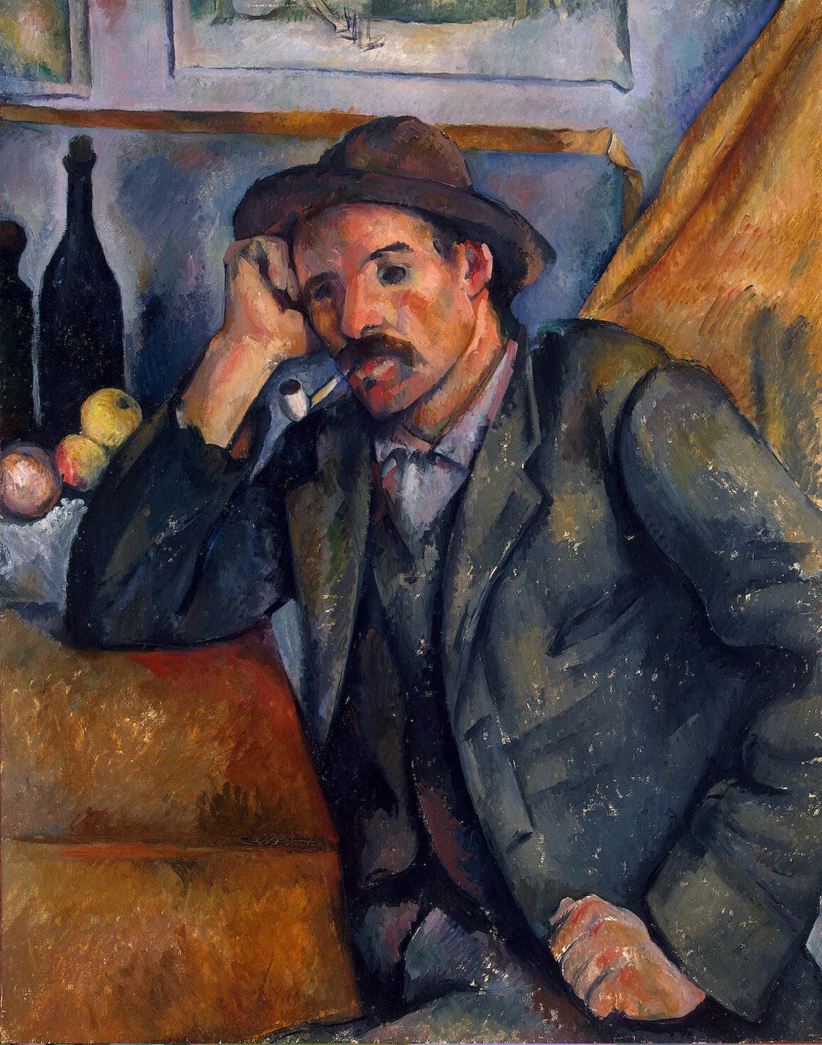
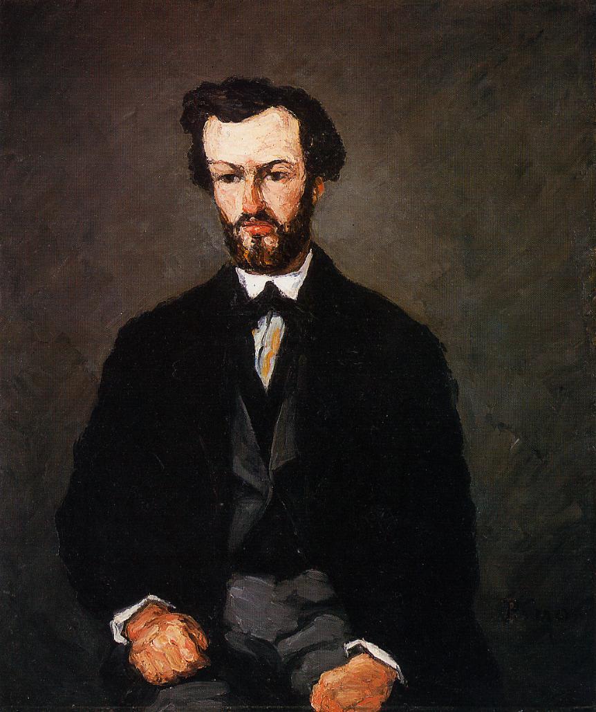
But Cézanne: a large portrait, a seated man (M. Valabrègue) with lots of black on a lead-black ground. His face, and his fists resting on his lap below, their skin tones intensified all the way to orange, are strongly and unequivocally put there.

Paul Cezanne. Portrait of Anthony Valabregue. 1866.

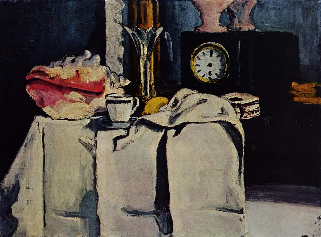
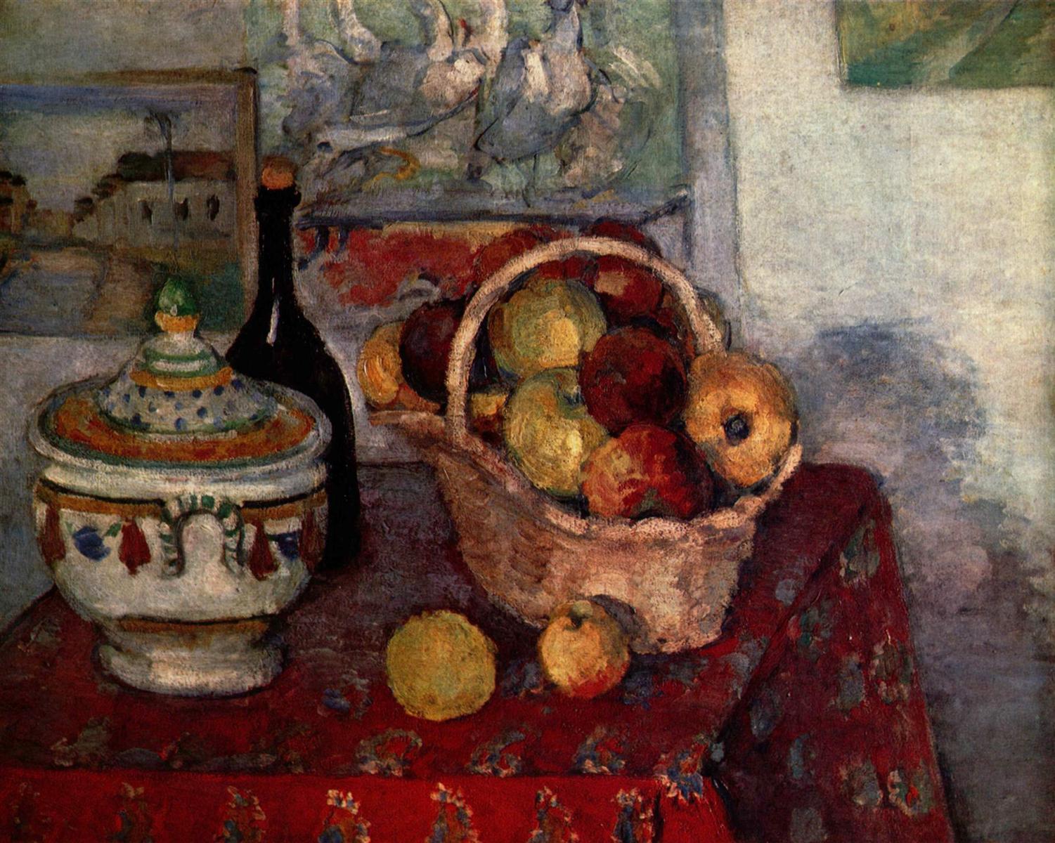
A still life, equally preoccupied with black; on a smoothly black table a long loaf of white bread in natural yellow, a white cloth, a thick-walled wine glass on a stem, two eggs, two onions, a tin milk container, and, obliquely resting against the loaf, a black knife.

Paul Cezanne. Still life with bread and eggs. 1865

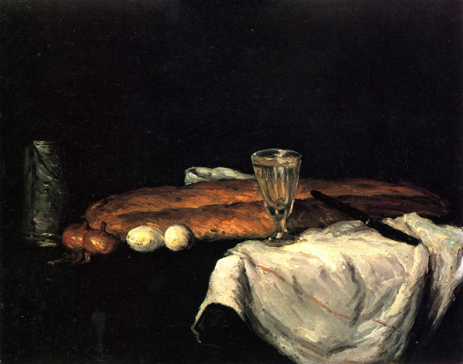
And here, even more than in the portrait, black is treated purely as a color, not as its opposite, and is recognized again as a color among colors everywhere: in the cloth, over whose white it is spread, inside the glass, muting the white of the eggs and weighting the yellow of the onions to old gold.

(Just as, without having quite seen this yellow yet, I surmised that there must have been black with it.)

Rainer Maria Rilke to Clara Rilke


Intercourse of Colors. Color Black. Reality

Isn’t it strange and wonderful, how the unfolding of life brings us exactly what we need (or at least it does if we pay attention)?

Not just more of Cézanne, but the miraculous continuation of the theme which both opens and closes his encounter with Cézanne in Paris: the color black.

And so, as this sequence of letters draws to its close, I ask you once again to pay attention to this mysterious color, which is both a color and the absence of it, depending on how we look at it.

There is a hidden, not fully open, parallel, between seeing black as color and “realizing that even something horrible, something that seems no more than disgusting, is, and is valid, along with everything else that is”.

Black and white behave perfectly colorlike next to the other colors

December 21, 2017 by Elena Maslova-Levin

black and white <…> behave perfectly colorlike next to the other colors, their equal in every way, as if long acclimatized.

Rainer Maria Rilke to Clara Rilke

OCTOBER 24, 1907 (Part 4)

The use of white as a color was natural to him from the start: together with black, it defined the two limits of his wide-open palette,

Paul Cezanne. The black marble clock. C. 1870.

and in the very beautiful ensemble of a black stone mantelpiece with a pendulum clock, black and white (the latter in a cloth that covers part of the mantel and hangs over its edge) behave perfectly colorlike next to the other colors, their equal in every way, as if long acclimatized.

(Differently than in Manet, whose black has the effect of a light being switched off and yet still stands opposed to the other colors as if coming from some other place.)

Edouard Manet. The lemon. 1880.

Brightly confronting each other on the white cloth are a coffee cup with a heavy dark-blue stripe on the edge, a fresh, ripe lemon, a cut crystal chalice with a sharply scalloped edge, and, way over on the left, a large, baroque triton shell—eccentric and singular in appearance, with its smooth, red orifice facing the front.

Paul Cezanne. The black marble clock. C. 1870.

Its inward carmine bulging out into brightness provokes the wall behind it to a kind of thunderstorm blue, which is then repeated, more deeply and spaciously, by the adjoining gold-framed mantelpiece mirror;

here, in the mirror image, it again meets with a contradiction: the milky rose of a glass vase which, standing on the black pendulum clock, asserts its contrast twice (first in reality, then, a little more yieldingly, in reflection).

Space and mirror-space are definitively indicated and distinguished—musically, as it were—by this double stroke; the picture contains them the way a basket contains fruit and leaves: as if all this were just as easy to grasp and to give.

But there’s still some other object on the bare mantelpiece, pushed up against the white cloth: I’d like to go back to the picture to see what it was.

But the Salon no longer exists; in a few days it will be replaced by an exhibition of automobiles which will stand there, long and dumb, each one with its own idée fixe of velocity.

Rainer Maria Rilke to Clara Rilke


Presence. Intercourse of colors

As you read this portrait-in-words of a still life, don’t you find it hard to believe that it is written completely from memory?

Earlier, Rilke wrote about the greatness of Cézanne’s watching. In these descriptions from memory, we see his own great watching: the sheer quality of presence and attention he brought to this encounter with Cézanne.

I had to re-read the letter, following the flow of words around the picture with more focused attention, to even find that single object he forgot… Did you?


Blows and slashes of tree- and bush-green

December 5, 2017 by Elena Maslova-Levin

Another painting by van Gogh, but how different are its greens… one can hardly believe that we can use one word to name these colors.

OCTOBER 17, 1907 (Part 3)

A park or an alley in a town park in Arles, with black people on benches on the right and left, a blue newspaper reader in front and a violet woman in the back, beneath and among blows and slashes of tree- and bush-green.

Vincent Van Gogh. Entrance to the public garden in Arles. 1888

Rainer Maria Rilke to Clara Rilke


STORYLINE: COLORS AND WORDS

Yesterday, we looked at a green that was deep and utterly shallow in artificial wakefulness. Today, it is tree- and bush-green in full sunlight.

SEEING PRACTICE: COLOR GREEN

Compare the greens of the park with the greens of the night cafe. What is it that makes them so radically different?

Vincent Van Gogh. The Night Cafe. 1888.

Every insight has its parvenus

November 15, 2017 by Elena Maslova-Levin

… you notice two things right away: that every insight has its parvenus, upstarts who make a hue and cry as soon as they catch on,—and then, that perhaps it’s not so much a question of insights, which bring up too much consciousness.

Rainer Maria Rilke to Clara Rilke


We often hear nowadays that all one needs to do to unleash one’s creativity is to go deep inside oneself. It is there, and only there, that our unique insights are to be revealed.

But this is not enough. If the artist’s vision, and their consciousness, are not informed, refined,  expanded by the art of the past, then we are bound to re-invent wheels, and blindly believe our naive inventions to be new and unique.

Cézanne’s was a magnificent achievement, but it is deeply grounded in the work of his predecessors; just like no peak can exist without a mountain.

So Rilke goes to the Louvre.

He keeps dancing between the past and the present, discovering the past in the present (and vice versa).


OCTOBER 8, 2017 (PART 1)

It’s strange to walk through the Louvre after two days in the Salon d’Automne: you notice two things right away: that every insight has its parvenus, upstarts who make a hue and cry as soon as they catch on,—and then, that perhaps it’s not so much a question of insights, which bring up too much consciousness.

As if these masters in the Louvre didn’t know that painting is made up of color. I’ve looked at the Venetians: they’re of an indescribably radical colorfulness; you can feel how far it goes in Tintoretto.

Tintoretto. The coronation of the virgin. C. 1580. Click to see on the Louvre’s website.

Almost further than with Titian.

Titian. The Pastoral Concert. C. 1509. Click to see on the Louvre’s website.

And so on into the eighteenth century, where the only thing separating their color scale from Manet’s is the use of black.

Guardi has it, incidentally; it was unavoidable, right there in the middle of all that brightness, ever since the laws against extravagant display decreed the use of black gondolas.

Francesco Guardi. The Rialto Bridge with the Palazzo dei Camerlenghi. 1763.

But he still uses it more as a dark mirror than as a color; Manet was the first—encouraged by the Japanese, certainly—to give it equal value among the other colors.

Edouard Manet. Berthe Morisot with a Fan. 1872.

Rainer Maria Rilke to Clara Rilke


INTERCOURSE of Colors

For Rilke, Cézanne’s major achievement is in color — in recreating reality in colors, in their mutual intercourse. Not every artist would agree with that, but I do.

So it is the pre-history of this achievement that he is looking for and seeing in the Louvre: opening the palette to pure primary colors, and including black as a color (rather than simply the absence of color, “the dark mirror” which absorbs all light).

SEEING PRACTICE: the COLOR BLACK

The difference between black as absence of color, as pure darkness, versus black as an equal among colors is rooted deeply in the biology of human vision.

The human eye has different photoreceptors for these two visual perceptions.

“Rods” are responsible for detecting the amount of light; for them, “black” means darkness. They are concentrated on the periphery of retina, and we use them mainly when there isn’t enough light to detect color differences.

“Cons” are concentrated in the centre of the retina, and they are responsible for color recognition. There are three types of cons, “red”, “blue” and “green”; for them, “black” means a certain combination of these signals, just like any other color.

To notice the difference between the two perceptions of black in real life, you can either squint (to decrease the amount of light perceived by the eye) or turn your head to use your peripheral vision.

All of reality is on his side

November 14, 2017 by Elena Maslova-Levin

Here, all of reality is on his side: in this dense quilted blue of his, in his red, and his shadowless green, and the reddish black of his wine bottles.

Rainer Maria Rilke to Clara Rilke


Finally, Cézanne. After the long detour of yesterday’s letter, Rilke faces this new reality head-on, without further delays.

He says so much in a single sentence that I had to add four paintings to re-create it in images. These might not be the exact same paintings he saw on that day, but he isn’t really writing about individual paintings, but rather about all of them simultaneously.


OCTOBER 7, 1907

You know how much more remarkable I always find the people walking about in front of paintings than the paintings themselves. It’s no different in this Salon d’Automne, except for the Cézanne room.

Here, all of reality is on his side: in this dense quilted blue of his,

Paul Cezanne. Mont Sainte-Victoire and Château Noir. 1904-1906. Click to zoom in (on Google Cultural Institute site)

in his red

Paul Cezanne. Madame-Cezanne with a yellow-armchair. 1890.

and his shadowless green

Paul Cezanne. View of L’Estaque and Chateaux-d’If. 1885.

and the reddish black of his wine bottles.

Paul Cezanne. Still life with soup tureen. 1884.

And the humbleness of all his objects: the apples are all cooking apples and the wine bottles belong in the roundly bulging pockets of an old coat.

Paul Cezanne. The smoker. 1890.

Rainer Maria Rilke to Clara Rilke


STORYLINE: COLORs and WORDS

How can one make landscapes and things out of WORDS as Cézanne made them out of colors?

This challenge is implicitly always there in the letters, and one way Rilke faces it is through finding new ways of naming the colors themselves.

This letter is a tentative beginning of what would blossom into color-filled prose by the end of the month.

SEEING PRACTICE: COLOR BLUE

I have chosen one painting for each color mentioned in Rilke’s letter, but my choice may be arbitrary and subjective. ALL Cézanne’s colors are there in every painting, but in very different versions of themselves.

I wonder what Rilke really meant, and Clara Rilke saw in her mind’s eye when she read this phrase, “this dense quilted blue of his“. There are many different blues even in the paintings included here.

What came up in my mind’s eye was this very specific kind of blue, the blue of the sky above Mont Sainte-Victoire and Château Noir (1904-1906), spilling into the folds of this painting’s mountain, and into the shadows of its greenery.

Paul Cezanne. Mont Sainte-Victoire and Château Noir. 1904-1906.

But I wonder, can this phrase also point to ALL of Cézanne’s blues, to something they all share?


Copyright © 2025 · Atmosphere Pro on Genesis Framework · WordPress · Log in

  • About this program
  • Resources