• Skip to content

The right eyes: Rilke on painting

Rilke on painting

Main navigation

  • About this program
    • Index
  • Resources

Blog

Full of mutual understanding

December 23, 2017 by Elena Maslova-Levin

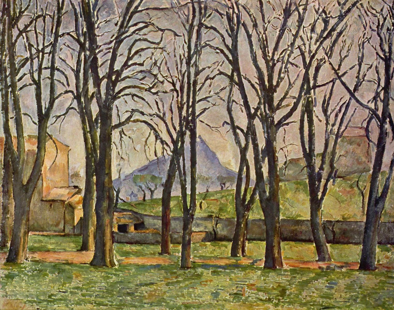
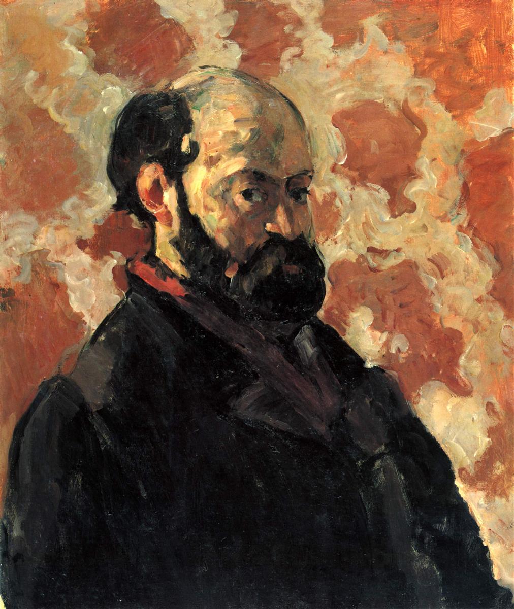
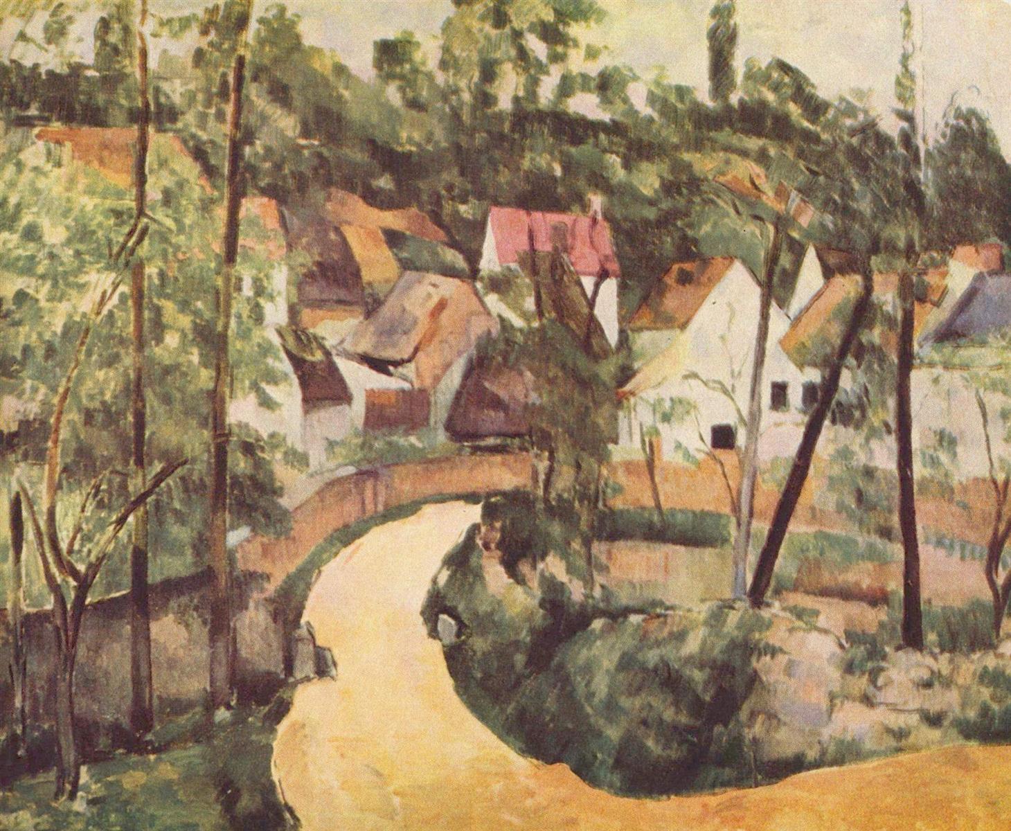
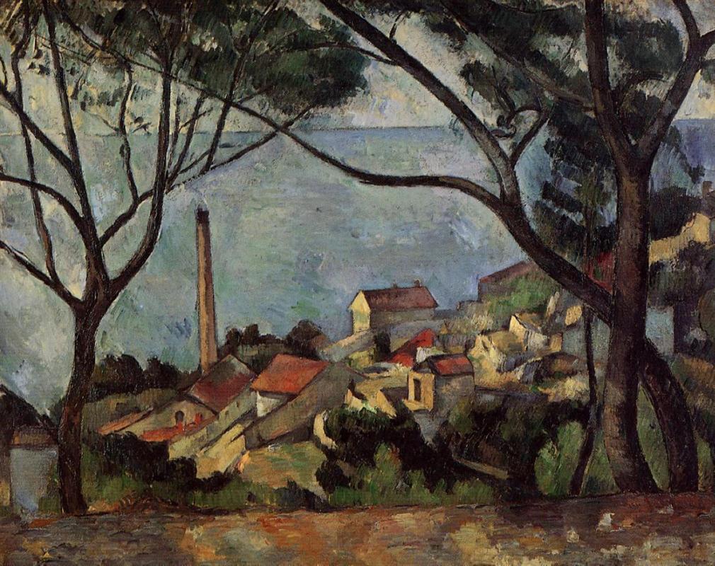
… airy blue, blue sea, red roofs, talking to each other in Green and very moved in this inner conversation, and full of mutual understanding …

Rainer Maria Rilke

This is the second part of Rilke’s letter from Prague.


NOVEMBER 7, 1907 (Part 2)

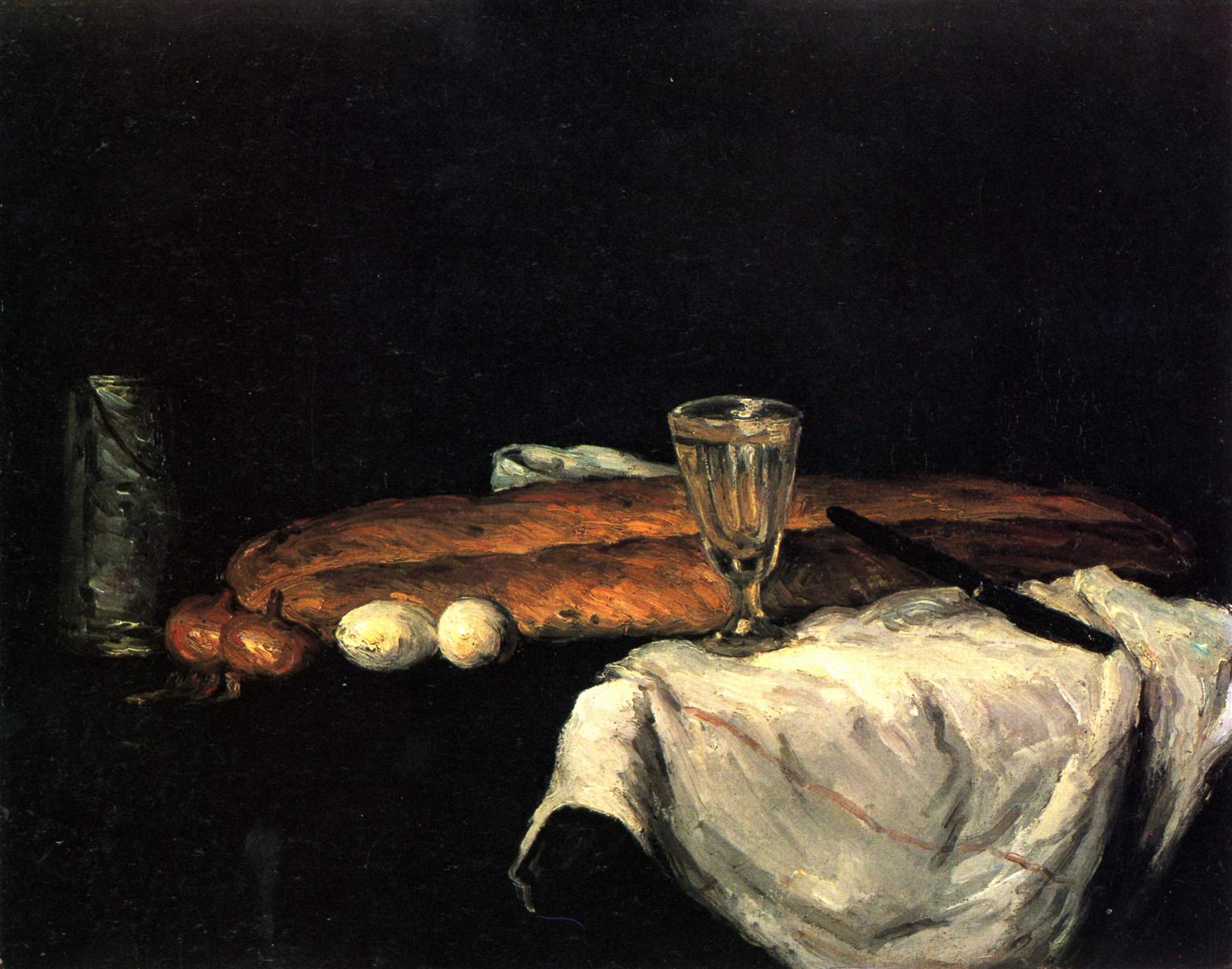
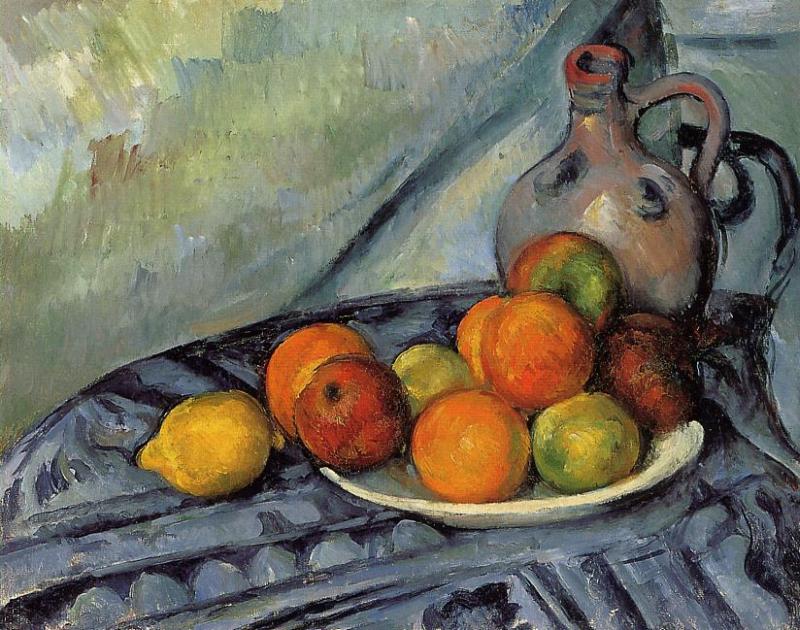
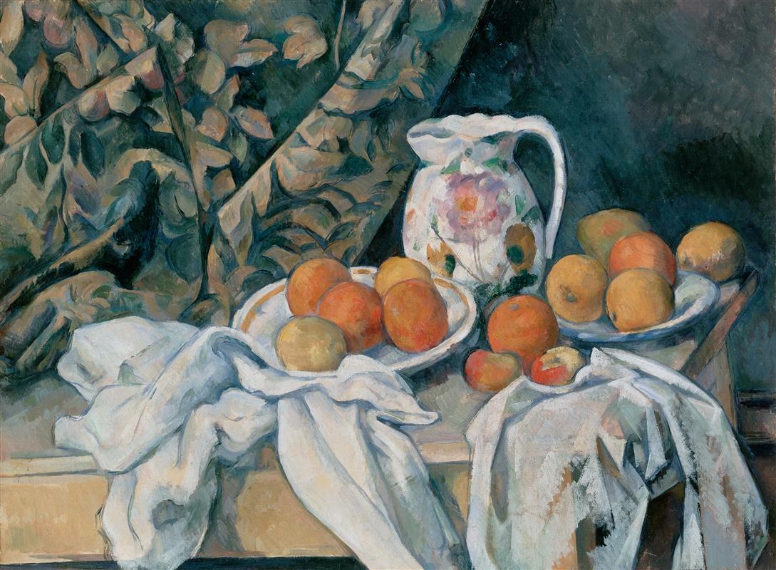
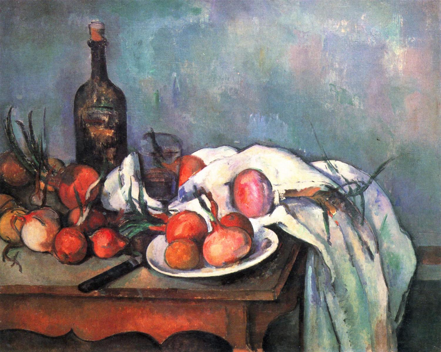
Next to this, a nature morte with a blue cover;  between its bourgeois cotton blue and the wall, which is overlaid with a light cloudy bluishness, an exquisite, large, gray-glazed ginger pot holding its own between right and left.

Paul Cezanne. Still life with apples. 1894. Click to zoom in (on Google Art Project).
Auguste Rodin. Eternal Spring. 1900.

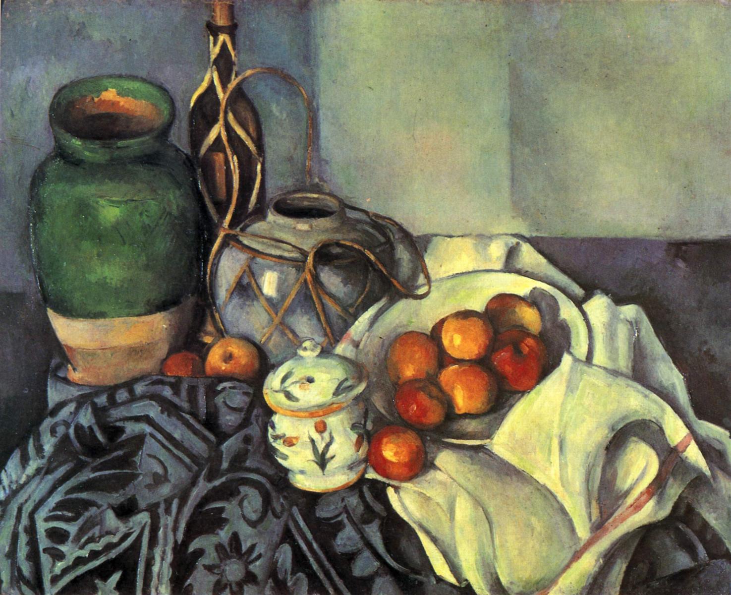
An earthy-green bottle of yellow Curaçao and furthermore a clay vase with a green glaze reaching down two thirds of it from the top. On the other side, in the blue cover, some apples have partly rolled out from a porcelain bowl whose white is determined by the cover’s blue.

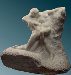
This rolling of red into blue is an action that seems to arise as naturally from the colorful events in the picture as the relationship between two Rodin nudes does from their sculptural affinity.

And finally a landscape of airy blue, blue sea, red roofs, talking to each other in Green and very moved in this inner conversation, and full of mutual understanding …

Paul Cezanne. The sea at L’Estaque. 1878.

Rainer Maria Rilke to Clara Rilke


The metaphor of painting as a conversation among colors unfolds, and now one color (Green) becomes the language the others are using to communicate.

And with this, the letters end, and we are left on our own.

And all we basically have to do is to be there, but simply, ardently, the way the earth simply is, consenting to the seasons, light and dark and altogether in space, not asking to rest upon anything other than the net of influences and forces in which the stars feel secure.

Filed Under: Art, Intercourse of colors, Monograph on the color blue Tagged With: Blue, Green, Landscape, Paul Cezanne, Seascape, Still life

Preoccupied with black

December 22, 2017 by Elena Maslova-Levin

… black is treated purely as a color, not as its opposite, and is recognized again as a color among colors everywhere

Rainer Maria Rilke to Clara Rilke

The Salon has closed, and Rilke has left Paris for Prague, but this encounter with Cézanne isn’t over yet.


NOVEMBER 4, 1907 (Part 1)

… will you believe that I came to Prague to see Cézannes? … Outside in the Manes-Pavilion, where the Rodin exhibit used to be, there was (as I fortunately learned just in time) an exhibition of modern pictures. The best and most remarkable: Monticelli and Monet well represented, Pissarro adequately; 3 things by Daumier. And 4 Cézannes. (Also van Gogh, Gauguin, Émile Bernard: each with several pieces.)

But Cézanne: a large portrait, a seated man (M. Valabrègue) with lots of black on a lead-black ground. His face, and his fists resting on his lap below, their skin tones intensified all the way to orange, are strongly and unequivocally put there.

Paul Cezanne. Portrait of Anthony Valabregue. 1866.

A still life, equally preoccupied with black; on a smoothly black table a long loaf of white bread in natural yellow, a white cloth, a thick-walled wine glass on a stem, two eggs, two onions, a tin milk container, and, obliquely resting against the loaf, a black knife.

Paul Cezanne. Still life with bread and eggs. 1865

And here, even more than in the portrait, black is treated purely as a color, not as its opposite, and is recognized again as a color among colors everywhere: in the cloth, over whose white it is spread, inside the glass, muting the white of the eggs and weighting the yellow of the onions to old gold.

(Just as, without having quite seen this yellow yet, I surmised that there must have been black with it.)

Rainer Maria Rilke to Clara Rilke


Intercourse of Colors. Color Black. Reality

Isn’t it strange and wonderful, how the unfolding of life brings us exactly what we need (or at least it does if we pay attention)?

Not just more of Cézanne, but the miraculous continuation of the theme which both opens and closes his encounter with Cézanne in Paris: the color black.

And so, as this sequence of letters draws to its close, I ask you once again to pay attention to this mysterious color, which is both a color and the absence of it, depending on how we look at it.

There is a hidden, not fully open, parallel, between seeing black as color and “realizing that even something horrible, something that seems no more than disgusting, is, and is valid, along with everything else that is”.

Filed Under: Intercourse of colors, Reality Tagged With: Black, Early work, Paul Cezanne, Portrait, Still life

Black and white behave perfectly colorlike next to the other colors

December 21, 2017 by Elena Maslova-Levin

black and white <…> behave perfectly colorlike next to the other colors, their equal in every way, as if long acclimatized.

Rainer Maria Rilke to Clara Rilke

OCTOBER 24, 1907 (Part 4)

The use of white as a color was natural to him from the start: together with black, it defined the two limits of his wide-open palette,

Paul Cezanne. The black marble clock. C. 1870.

and in the very beautiful ensemble of a black stone mantelpiece with a pendulum clock, black and white (the latter in a cloth that covers part of the mantel and hangs over its edge) behave perfectly colorlike next to the other colors, their equal in every way, as if long acclimatized.

(Differently than in Manet, whose black has the effect of a light being switched off and yet still stands opposed to the other colors as if coming from some other place.)

Edouard Manet. The lemon. 1880.

Brightly confronting each other on the white cloth are a coffee cup with a heavy dark-blue stripe on the edge, a fresh, ripe lemon, a cut crystal chalice with a sharply scalloped edge, and, way over on the left, a large, baroque triton shell—eccentric and singular in appearance, with its smooth, red orifice facing the front.

Paul Cezanne. The black marble clock. C. 1870.

Its inward carmine bulging out into brightness provokes the wall behind it to a kind of thunderstorm blue, which is then repeated, more deeply and spaciously, by the adjoining gold-framed mantelpiece mirror;

here, in the mirror image, it again meets with a contradiction: the milky rose of a glass vase which, standing on the black pendulum clock, asserts its contrast twice (first in reality, then, a little more yieldingly, in reflection).

Space and mirror-space are definitively indicated and distinguished—musically, as it were—by this double stroke; the picture contains them the way a basket contains fruit and leaves: as if all this were just as easy to grasp and to give.

But there’s still some other object on the bare mantelpiece, pushed up against the white cloth: I’d like to go back to the picture to see what it was.

But the Salon no longer exists; in a few days it will be replaced by an exhibition of automobiles which will stand there, long and dumb, each one with its own idée fixe of velocity.

Rainer Maria Rilke to Clara Rilke


Presence. Intercourse of colors

As you read this portrait-in-words of a still life, don’t you find it hard to believe that it is written completely from memory?

Earlier, Rilke wrote about the greatness of Cézanne’s watching. In these descriptions from memory, we see his own great watching: the sheer quality of presence and attention he brought to this encounter with Cézanne.

I had to re-read the letter, following the flow of words around the picture with more focused attention, to even find that single object he forgot… Did you?


Filed Under: Colors and words, Intercourse of colors, Presence, Work Tagged With: Black, Colour, Early work, Paul Cezanne, Reflection, Still life

No one outside needs to think himself addressed or accosted

December 20, 2017 by Elena Maslova-Levin

OCTOBER 24, 1907 (Part 3)

Although one of his idiosyncrasies is to use pure chrome yellow and burning lacquer red in his lemons and apples, he knows how to contain their loudness within the picture: cast into a listening blue, as if into an ear, it receives a silent response from within, so that no one outside needs to think himself addressed or accosted.

Paul Cezanne. Fruit and jug on a table. C. 1894.

His still lifes are so wonderfully occupied with themselves.

The frequently used white cloth, for one, which has a peculiar way of soaking up the predominant local color, and the things placed upon it now adding their statements and comments, each with its whole heart.

Paul Cezanne. Still life with curtain and flowered pitcher. 1895.

Rainer Maria Rilke to Clara Rilke


STORYLINE: Intercourse of colors

On October 21, Rilke wrote about painting as “something that takes place among colors”, their  mutual intercourse being the whole of painting.

Here, this insight unfolds itself through the metaphor of painting as conversation among colors, complete with listening, responding, statements and comments.

Colors talk among themselves, and all the spectator has to do is witness this conversation.

SEEING practice: Cezanne

There are two “listening” colors here, the humble, unobtrusive blue of the first still life, and the white cloth of the second. Do you see how different their listening is?


Filed Under: Art, Intercourse of colors Tagged With: Blue, Colour, Paul Cezanne, Red, White cloth, Yellow

The inner equilibrium of Cézanne’s colors

December 19, 2017 by Elena Maslova-Levin

… the inner equilibrium of Cézanne’s colors, which never stand out or obtrude, evokes this calm, almost velvetlike air which is surely not easily introduced into the hollow inhospitality of the Grand Palais.

Rainer Maria Rilke to Clara Rilke


October 24, 1907 (Part 2)

When I made this remark, that there is nothing actually gray in these pictures (in the landscapes, the presence of ocher and of unburnt and burnt earth colors is too palpable for gray to develop),

Paul Cezanne. Chestnut Trees at the Jas de Bouffan. 1887. Click to zoom in (on Google Art Institute website).

Miss Vollmoeller pointed out to me how, standing among them, one feels a soft and mild gray emanating from them as an atmosphere,

Paul Cezanne. Still Life with Curtain and Flowered Pitcher. 1985.

and we agreed that the inner equilibrium of Cézanne’s colors, which never stand out or obtrude, evokes this calm, almost velvetlike air which is surely not easily introduced into the hollow inhospitality of the Grand Palais.

Paul Cezanne. Harlequin. 1890. Click to zoom in (on Google Art Institute website).

Rainer Maria Rilke to Clara Rilke


STORYLINE: INTERCOURSE OF COLORS

Many painters and art historians have attempted to define “color harmony”, and my guess is, these attempts will go on so long as men can breath and eyes can see. 

This is in our nature, to try and “define” our words, our languages teasing us everyday with the organic fluidity of what we (with charmingly naive arrogance) call “meanings”.

(Rilke wrote once that happy is he who knows that beyond all languages sits the Unsayable.)

But I don’t expect that, in my lifetime, I will see a better description of what “color harmony” actually is than what Rilke gives in this letter.

SEEING PRACTICE: COLOR HARMONY

Cézanne mastered every register of this ancient organ of color. He could fill the seemingly grey with every color of the rainbow (and more), and bring the boldest, most intense colors into the state of quiet conversation with one another.

The paintings I have chosen for this segment range from the muted lightness of an evening forest to the bold pattern of Harlequin’s attire. Yet the effect described by Rilke is there in all and every one of them.


Filed Under: Colors and words, Intercourse of colors Tagged With: Gray, Landscape, Paul Cezanne, Still life

Gray, literally gray, cannot be found in Cézanne’s pictures

December 18, 2017 by Elena Maslova-Levin

To his immensely painterly eye it didn’t hold up as a color: he went to the core of it and found that it was violet there or blue or reddish or green.

Rainer Maria Rilke to Clara Rilke


OCTOBER 24, 1907 (Part 1)

… I said: gray—yesterday, when I described the background of the self-portrait, light copper obliquely crossed by a gray pattern.

Paul Cezanne. Self-portrait in front of pink background. 1875.

I should have said: a particular metallic white, aluminum or something similar, for gray, literally gray, cannot be found in Cézanne’s pictures.

To his immensely painterly eye it didn’t hold up as a color: he went to the core of it and found that it was violet there or blue or reddish or green.

Paul Cezanne. Still life with red onions. 1896- 1898. Click to zoom in (on Google Art Project).

He particularly likes to recognize violet (a color which has never been opened up so exhaustively and so variously) where we only expect and would be contented with gray;

but he doesn’t relent and pulls out all the violet hues that had been tucked inside, as it were; the way certain evenings, autumn evenings especially, will address the graying facades directly as violet, and receive every possible shade for an answer, from a light floating lilac to the heavy violet of Finnish granite.

Paul Cezanne. A turn in the road. 1882. Click the image to zoom in (on Google Art Project).

Rainer Maria Rilke to Clara Rilke


STORYLINE: Intercourse of colors

If I were to name my absolute favorite in this extraordinary sequence of letters, this may well be the one.

It embodies and reenacts the very essence of painting: its ability to open our eyes to what we haven’t seen before, couldn’t even imagine seeing.

And Rilke not only describes, but intensifies this effect: what one might have missed in Cézanne, one cannot miss now, once it is named.

And the way he compares Cézanne to autumn evenings, in his ability to pull out colors from nature, to make the nature respond to the painter’s eye, just like it responds to the sunlight…

SEEING PRACTICE: GREY

Even the imperfections of reproductions conspire to help us see what Rilke is talking about here.

In the still life above, the reproduction pulls out and exaggerates the colors hidden in Cézanne grays. If you click to zoom in, you will see a more muted (and closer to life) image; but zoom in on the gray areas, on all the secret hues of grey. Zoom in on the landscape to see how difficult it is to transmit this experience of grey in reproduction.

And what about “real life”? Can one “zoom in” on its grey areas to recognize the hues which so often stay unseen, both literally and metaphorically?

Filed Under: Colors and words, Intercourse of colors Tagged With: Landscape, Paul Cezanne, Portrait, Self-portrait

  • Page 1
  • Page 2
  • Page 3
  • …
  • Page 9
  • Next Page »

Copyright © 2025 · Atmosphere Pro on Genesis Framework · WordPress · Log in

  • About this program
  • Resources